Plotter allows for extensive customization of charts to support analysis of alternative data and general financial analysis.
There are 2 levels at which you may customize charts:
Chart settings: these apply to the entire chart, and control for example the chart type, axes and legend.
Signal settings: these apply per-signal. Different signals may have different signal settings.
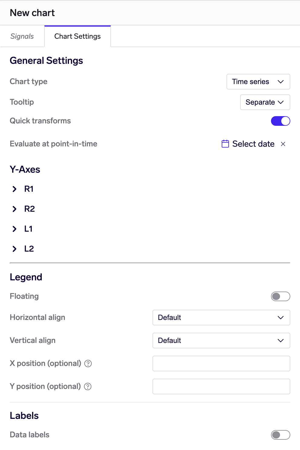
Chart Settings
Chart settings are accessed from the "Chart Settings" tab in the left-hand pane in Plotter:
Chart settings tab
General Settings
Chart type: choose either Time series or categorical charts (Column, Bar, Pie). Note that some chart settings are only available for specific chart types.
📘
Time series vs categorical charts
Time series charts have dates on the x-axis, while categorical charts have no date axis and instead have categories represented on their primary axis (1 category for each time series returned).
It is possible to configure time series charts as with line, column or area plots, by setting the Series type under Signal settings. See also the examples below.
Tooltip (only for Time series charts): affects how tooltips appear when there are multiple time series plotted.
Separate: only 1 tooltip is shown for the nearest time series
Split: 1 tooltip is shown per time series, positioned next to that time series
Shared: only 1 tooltip is shown, but it includes all time series on the chart
Quick transforms: if this is enabled, 2 additional drop-downs appear next to the date range controls, allowing you to apply moving averages/calendar aggregation and/or absolute/relative change calculations. These transforms apply to all signals in the chart.
👍
Using quick transforms
Quick transforms allow you (or others who you share the chart with) to quickly transform data without having to edit any of the signals. If you have shared a chart on a read-only basis with other users, quick transforms allow them to also apply the transforms without needing to edit the chart.
If you save a chart with a quick transform applied, this will be saved together with the chart and become the default transform when any user opens the chart.
Evaluate at point in time: evaluate all signals as of a given point-in-time. This is useful for doing quick checks on data and how it might have looked in the past. Important - this requires data to have been loaded with point-in-time history.
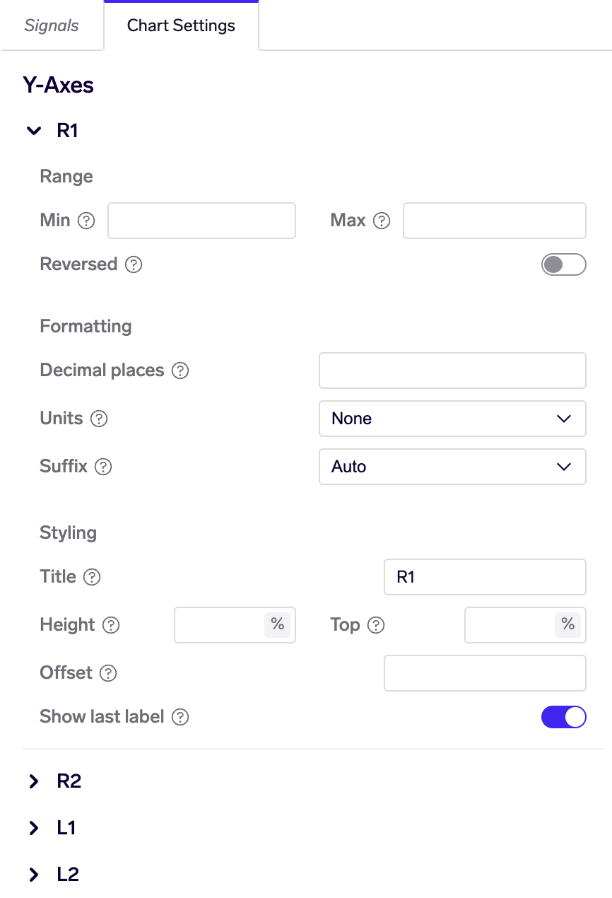
Y-Axes
(This is available for time series charts only. All settings here are optional.)
Each time series chart comes with 4 pre-defined y-axes: L1, L2, R1, R2. Each signal may be assigned to a different y-axis (see below). The y-axes may be configured as follows:
Range
Min, max: specifies a fixed range for the y-axis. Note that the chart may still adjust the min/max to optimize for nicer intervals between y-axis ticks.
Reversed: if checked, puts larger values below and smaller values on top - useful for visualizing ranks.
Formatting
Decimals: number of decimal places to display on the y-axis.
Units: whether to format numbers as percentages (%), percentage points (pp) or basis points (bps).
📘
Unit multipliers
If you choose to format with units, values are multiplied by 100 for percentage and percentage points and 10,000 for basis points.
For example, if percentage is chosen, a data point of 0.50 would be formatted as 50%, while a data point of 50 would be formatted as 5000%.
Suffix: choose a specific suffix like thousands (K), millions (M), billions (B) or trillions (T), or leave as the default for Auto suffixing. Alternatively, turn suffixing off completely (None).
Styling
Title: this is displayed in small font above each y-axis
Height, top: this controls the height and top position (in percent) of the y-axis within the overall plot. This is useful for creating charts that stack 2 y-axes on top of each other, effectively creating 2 sub-plots within the chart. See example below.
Offset: this controls the position (in pixels) of the y-axis from the plot area. This is useful for creating charts with stacked y-axes, by giving them both 0 offset.
Show last label: whether to show the last (top) y-axis tick label. Again useful for creating charts with stacked y-axes.
Legend
Floating: if toggled, causes the legend to "float" above the plot area, rather than occupying a separate area in the chart.
Horizontal align: left / center / right (default is left).
Vertical align: top / middle / bottom (default is bottom).
X position: offset (in pixels) from the chosen horizontal alignment position. Negative values move the legend left, positive values move the legend right.
Y position: offset (in pixels) from the chosen vertical alignment position. Negative values move the legend up, positive values move the legend down.
Labels
Data labels: whether to show labels showing the value on each data point in the chart. Useful for low-frequency (eg monthly, quarterly or less) time series charts, and for categorical charts (column/bar/pie).
Not recommended for daily / weekly time series charts as the large number of labels will make the chart very slow to display and use.
Time series column chart with data labels
Signal Settings
Signal settings allow you to adjust additional settings per-signal. For example, you can set the color of the signal's plot, enable markers, or make line plots thicker / thinner.
Signal settings for time series charts
📘
Settings for signals that produce multiple time series
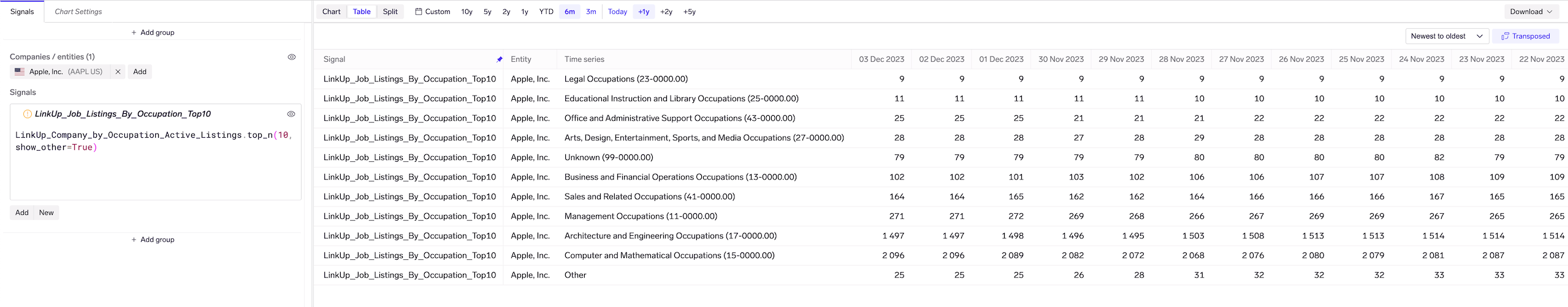
Many signals produce just 1 time series per company / entity - for example, the Close_Price signal produces 1 time series per company. Other signals may produce multiple time series - for example, a job listings signal that takes a company and breaks down job listings by occupation.
Signal settings always apply to all time series for that signal. For example, if you set color to red, all time series produced by that signal will be colored red.
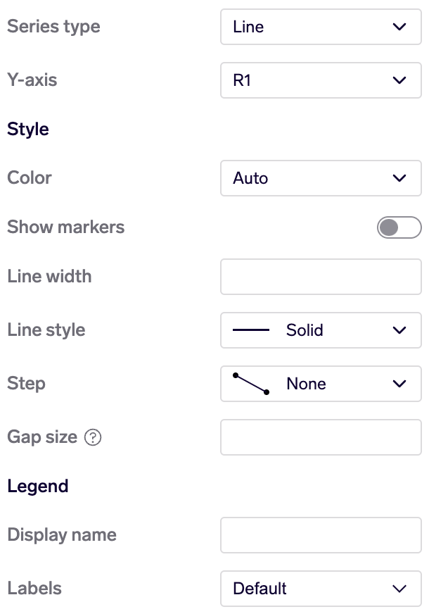
General
Only for time series charts
Series type: choose from line, column or area. Column and area series may also be stacked.
Color: leave as "Auto" to cycle through a standard palette of colors, or choose a specific color
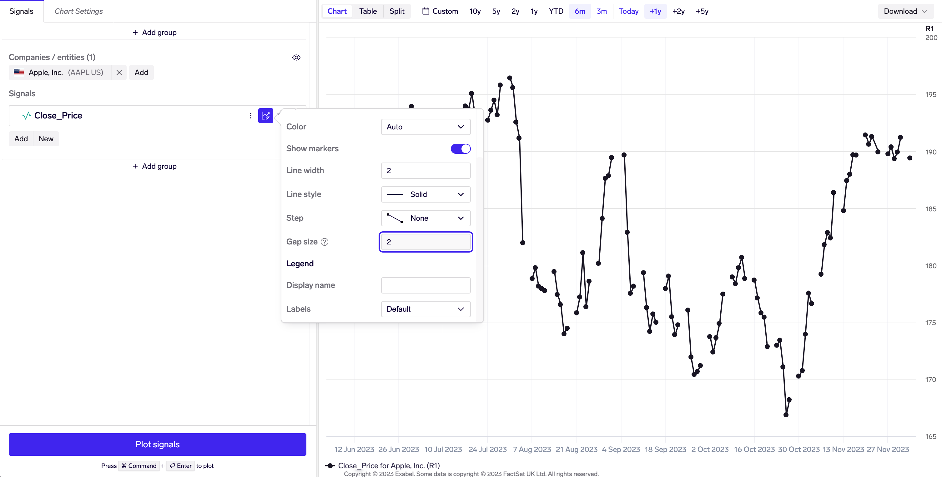
Show markers (only for line / area series): if enabled, plots a marker on each data point. Useful for low frequency (monthly, quarterly etc) time series.
Line width (only for line series): the width, in pixels, of the line
Line style (only for line series): use this to make dashed or dotted lines
Step (only for line / area series): use this to connect consecutive points with a stepped line rather than a straight line. Useful for plotting revisions charts (example).
Gap size (only for line / area series): show gaps between data points that are at least this many days apart.
A gap size of 2 on a daily share price chart causes gaps to be plotted on weekends.
Legend
📘
Series labels in the legend
There are 2 parts to chart labels in Exabel
Signal label: each signal has 1 label, defaults to how it is named in the Library (e.g. Close_Price), and may be overridden by setting Display name.
Time series label: each time series produced by the signal also has its own label. This helps to distinguish individual time series when 1 signal produces multiple time series.
LinkUp signal breaking down Apple job listings by occupation. Each time series has its own label for the occupation, as well as a common signal label.
Display name: if set, this overrides the signal label.
Labels: controls what to display in the chart legend and tooltips
Default: if a signal returns 1 time series, display the signal label; if a signal returns multiple time series, display the time series label
Signal: display only the signal label
Time series: display only the time series label
Signal - time series: display both the signal label and time series label
Examples
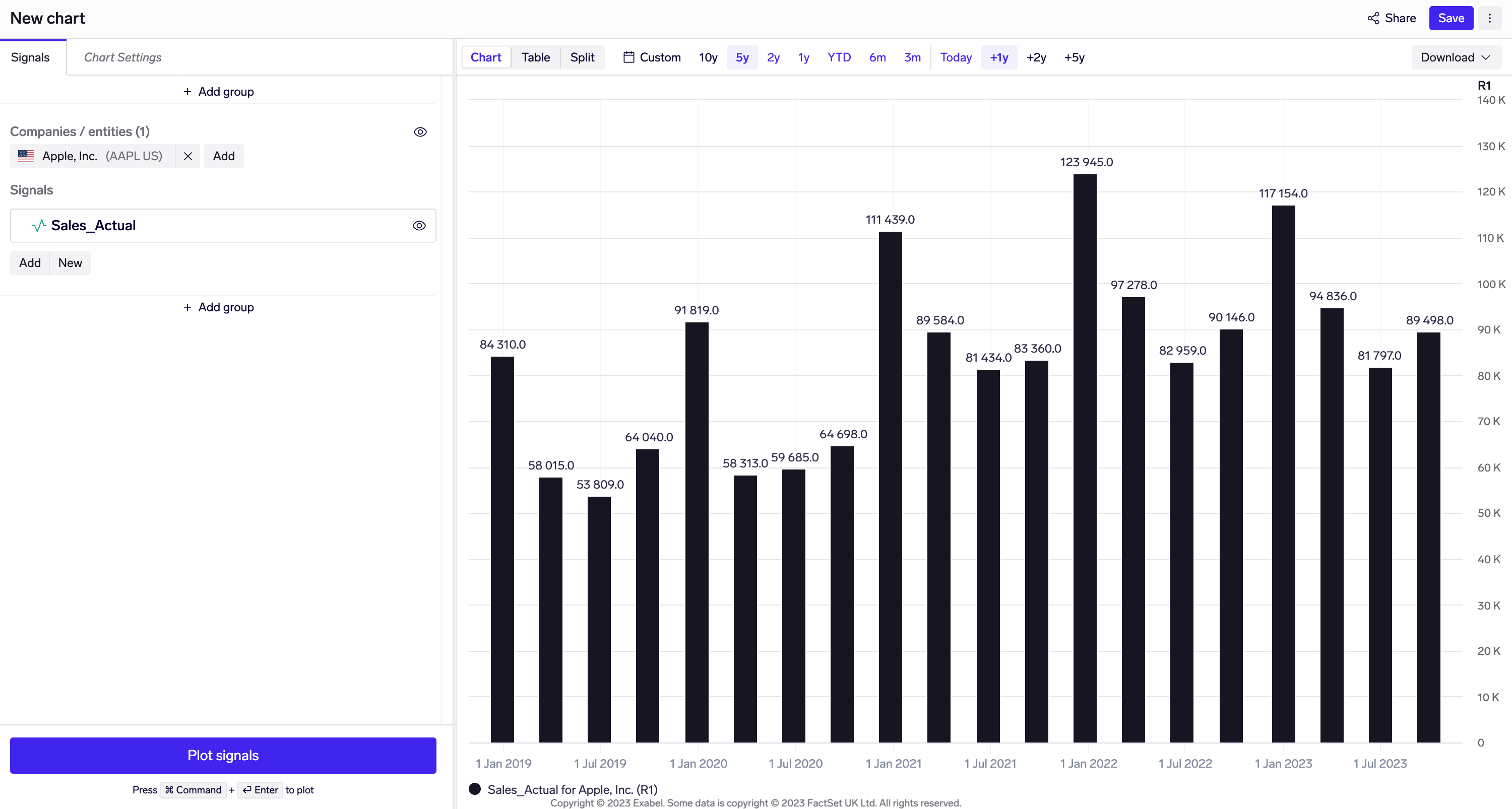
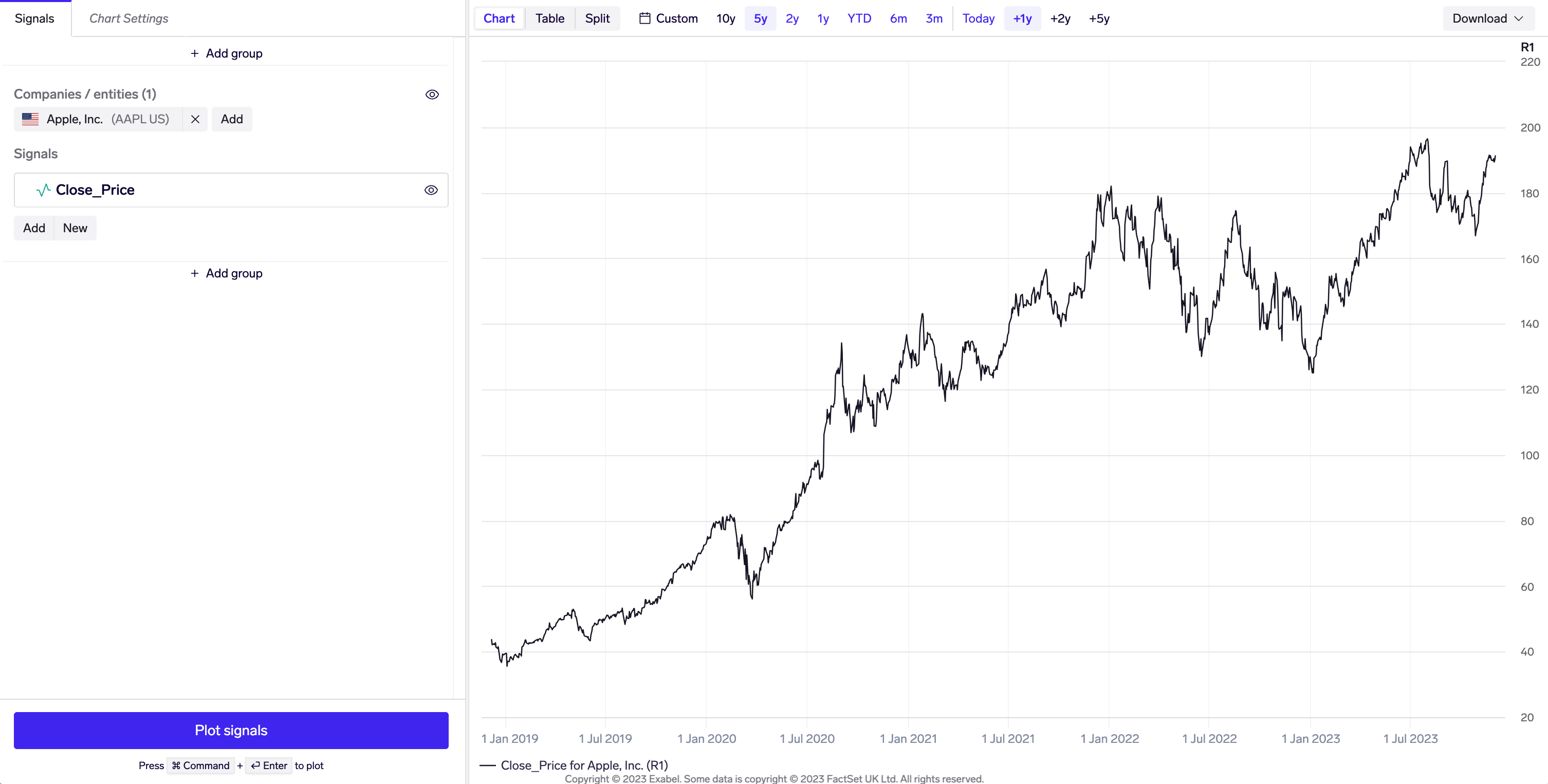
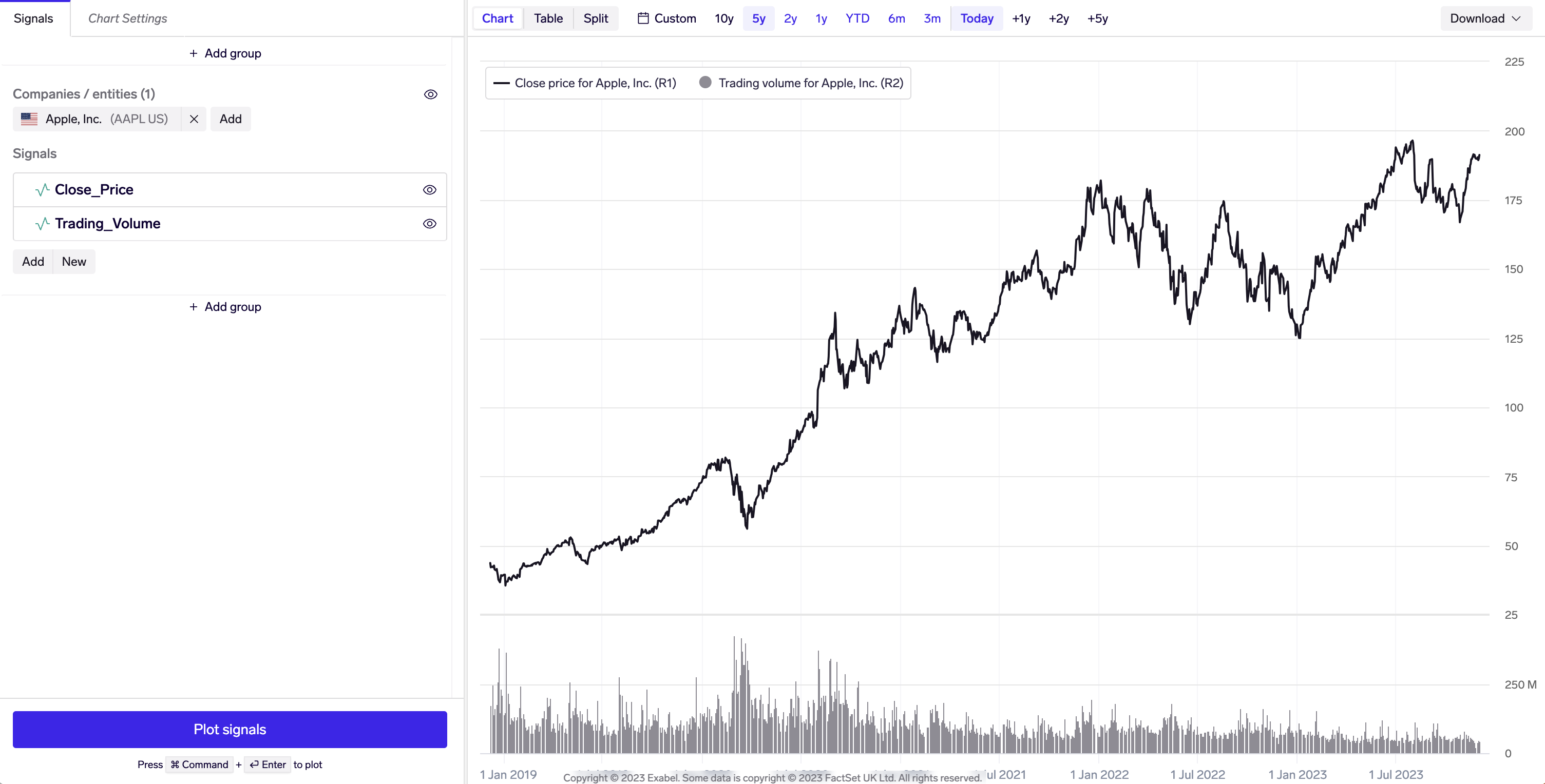
Time series, line chart
Time series line chart of Apple close price
How to configure: just add a company, and pick a signal from the Library. The Close_Price signal is available under Templates and data sets, in the Market metrics folder.
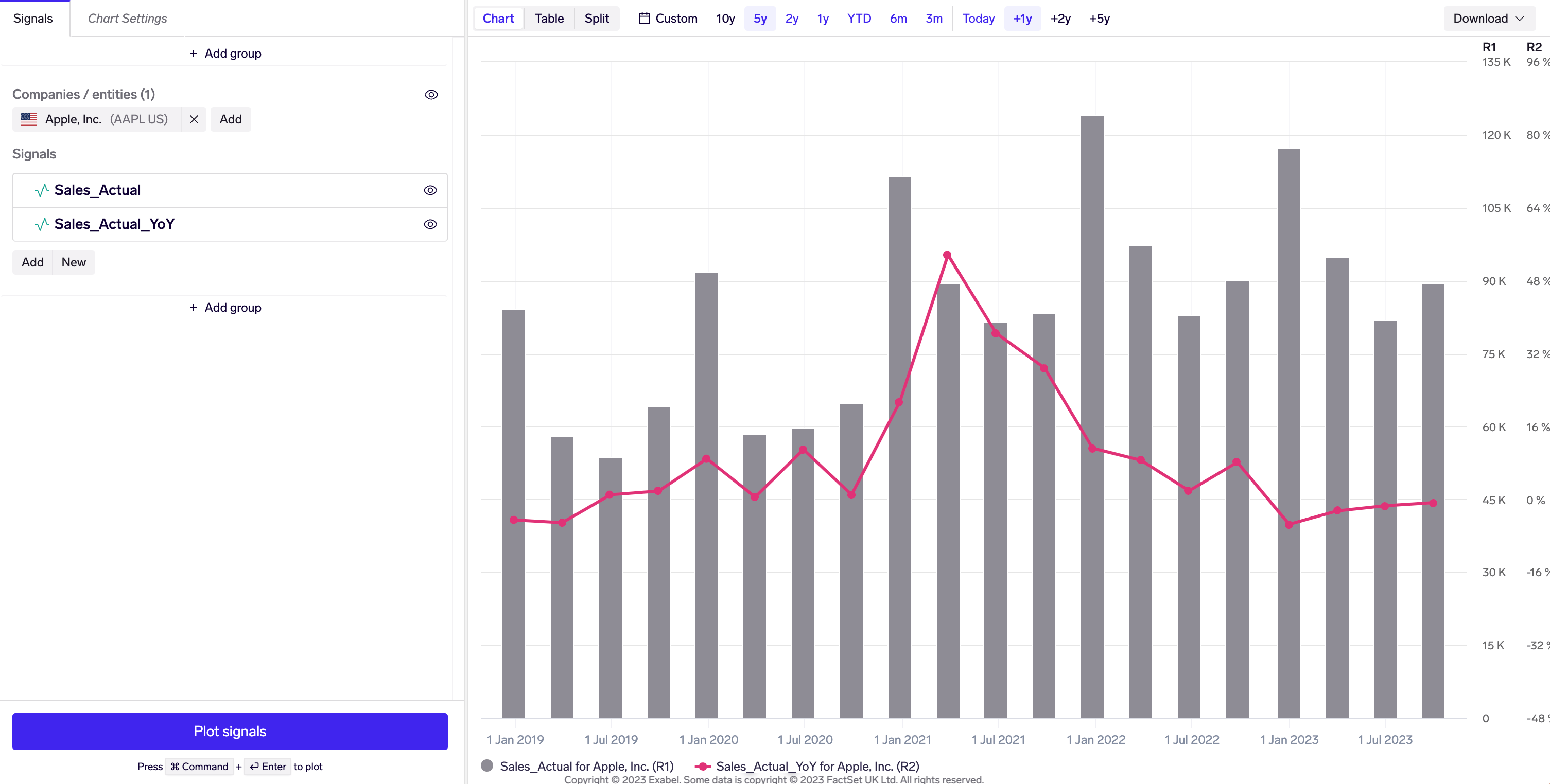
Time series, line & column chart, separate y-axes
Time series column chart of Apple quarterly sales, overlaid with line chart of sales YoY
How to configure:
Add a company.
Pick 2 signals from the Library, in this caseSales_Actual and Sales_Actual_YoY (found under Templates and data sets, in the FactSet Metrics (Interims) folder.
Configure Sales_Actual to display as time series columns, with a grey color for better contrast (Signal settings).
Configure Sales_Actual_YoY to use the R2 y-axis, with a red color for contrast, line width 3, and markers enabled (Signal settings).
Configure the R2 y-axis to display in units of percentage (Y-axes settings).
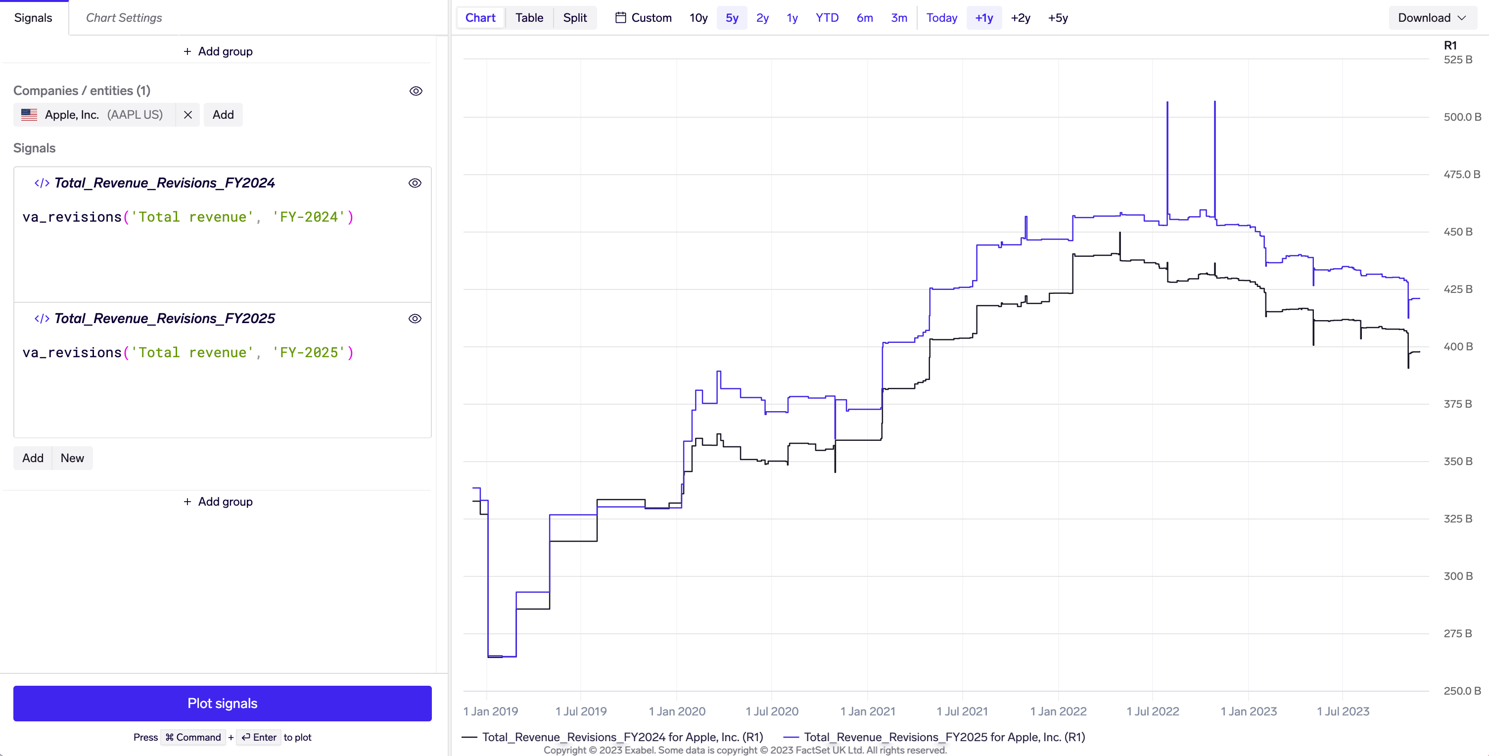
KPI revisions chart
Revisions chart of Apple revenue for FY-2024 and FY-2025
How to configure:
Add a company.
Pick a revisions signal - this can be consensus revisions or model (prediction) revisions.
 Using quick transforms