Monitoring KPIs
Monitor your models and data to identify inflection points and manage risk around results season
The KPI Analyzer monitoring view offers a comprehensive snapshot of all pertinent KPIs pertinent to a company. It is designed for busy analysts & PMs, consolidating all essential information about your models and data onto a single page.
On the overview table, users can see model predictions for each KPI, the delta to consensus, and a measure of model confidence. Clicking on any KPI provides access to detailed charts and insightful information, offering deeper insights into individual models and underlying data trends.
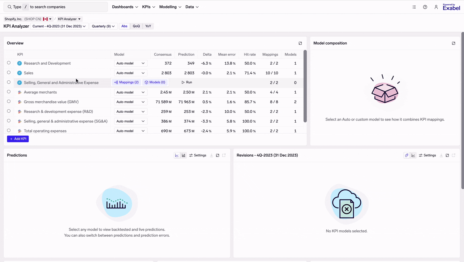
View options
At the top of the page, you'll see some controls for what is being viewed in the KPI Analyzer.
- Company: click here to switch companies
- Page: click here to go to another page for the current company
- Period: use this to switch to viewing the "Last" reported period, or the "Next" period (useful for understanding where a company might guide when it reports). Note that viewing the Last or Next period is a bit slower than Current.
- Frequency: companies that report semi-annually may also have quarterly KPIs; this lets you choose between viewing the quarterly / semi-annual KPIs.
- Display: whether to show absolute (Abs), QoQ/HoH, or YoY values for KPI predictions & consensus.
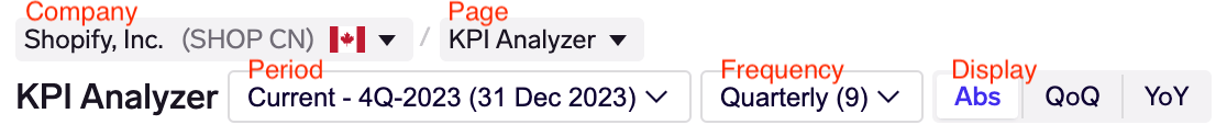
Overview
This summarizes all of the KPIs that you are monitoring for a given company.
- KPI: Financial or operational KPI from FactSet or Visible Alpha (denoted by their respective logos).
- Model: The name of the model being displayed in the table. Defaults to the Auto model, though you may also select other custom models that you have run.
Auto modelsAn Auto model may be run automatically on any KPI you choose by clicking on the "Run" button. Auto models will look to use all available KPI mappings* in order to train the most accurate model, using sensible model defaults.
To learn more, see Modelling KPIs.
*: Note that you must have access to the data in a KPI mapping for the Auto model to use it.
- Consensus: Latest consensus mean for that KPI.
- Prediction: Latest model prediction for that KPI.
- Delta: Difference between Prediction and Consensus. Expressed as a percentage for most KPIs, and in absolute terms for ratio KPIs (e.g. margin / growth).
- Mean error: Average (mean) error between the historical predictions and the actual / reported KPI.
- Hit rate: Percentage of the time historically that the model correctly calls a beat / miss vs consensus.
Mean error & hit rateThese metrics are calculated based on the most recent 8 periods (quarters / semi-annuals). However, some models may have fewer than 8 backtest periods due to limited data history. When hovering over the mean error, a tooltip shows the number of backtest periods used to calculate both the mean error and hit rate.
For newly run models, these will be calculated by doing backtesting (see Modelling KPIs to learn how this works). Once a model is created, it starts to make live predictions which can be compared against the actual KPI as companies report their results. Thus, the mean error & hit rate metrics will start to reflect live model performance.
- Mappings: Number of KPI mappings that you have access to (1st number), and the total number of KPI mappings available, including those from vendors you are not yet subscribed to (2nd number). To view or customize mappings, click into the Mappings view.
- Models: Number of KPI models you have access to. To view or customize models, click into the Models view.
From here, you may also add a new KPI to be monitored, although this will require you to add at least 1 KPI mapping (seeMapping KPIs).
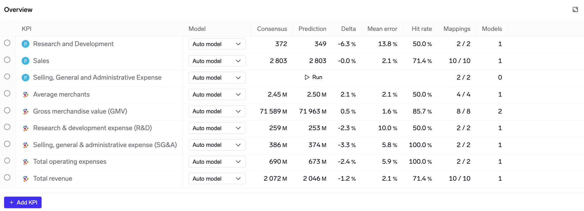
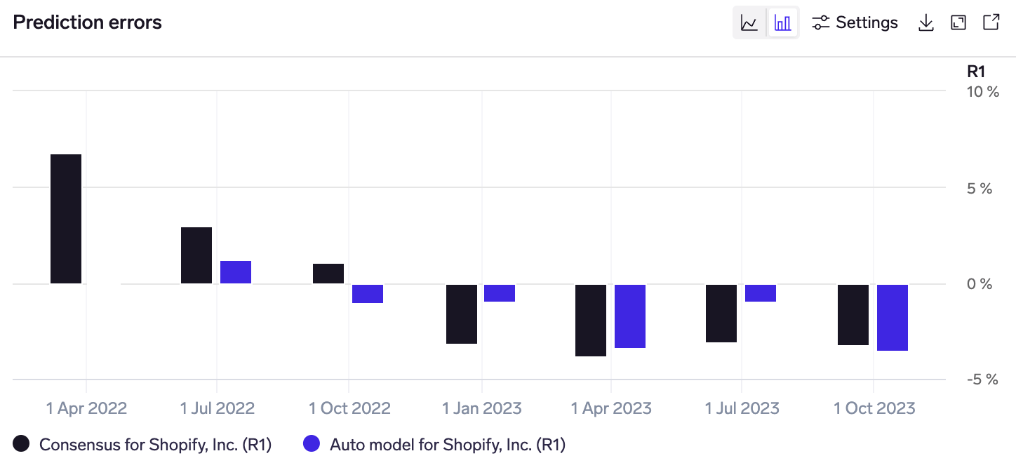
Predictions & errors
The predictions & errors charts are below the overview table. Once you have selected a KPI in the overview table, the predictions chart shows a time series of the KPI actual (reported) values, consensus mean, and model predictions. You can also click on Settings to look at a longer / shorter time range.
Additional buttons on the top-right of the chart allow you to download the chart & data, view it in full screen, or open in Plotter.
You can switch to the errors chart by clicking on the bar chart icon above the chart. This shows the error (difference) between the KPI actual (reported) values vs consensus / your model.
Revisions & intra-quarter tracker
Exabel runs your models daily to take advantage of any new / updated data from your KPI mappings. The predictions made every day are stored, providing a true point-in-time record for your models. This can be visualized in the revisions chart, overlaid with consensus revisions.
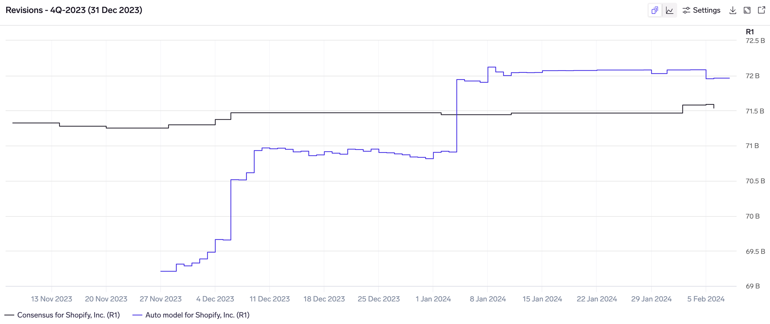
Model revisions overlaid with consensus revisions
This may be toggled with the intra-quarter chart, which shows how the model builds up through the quarter to the final prediction. If your model combines data from one or more KPI mappings, this will show a plot for each one, allowing you to visualize how data has trended over the quarter, and how each mapping is contributing to the final prediction.
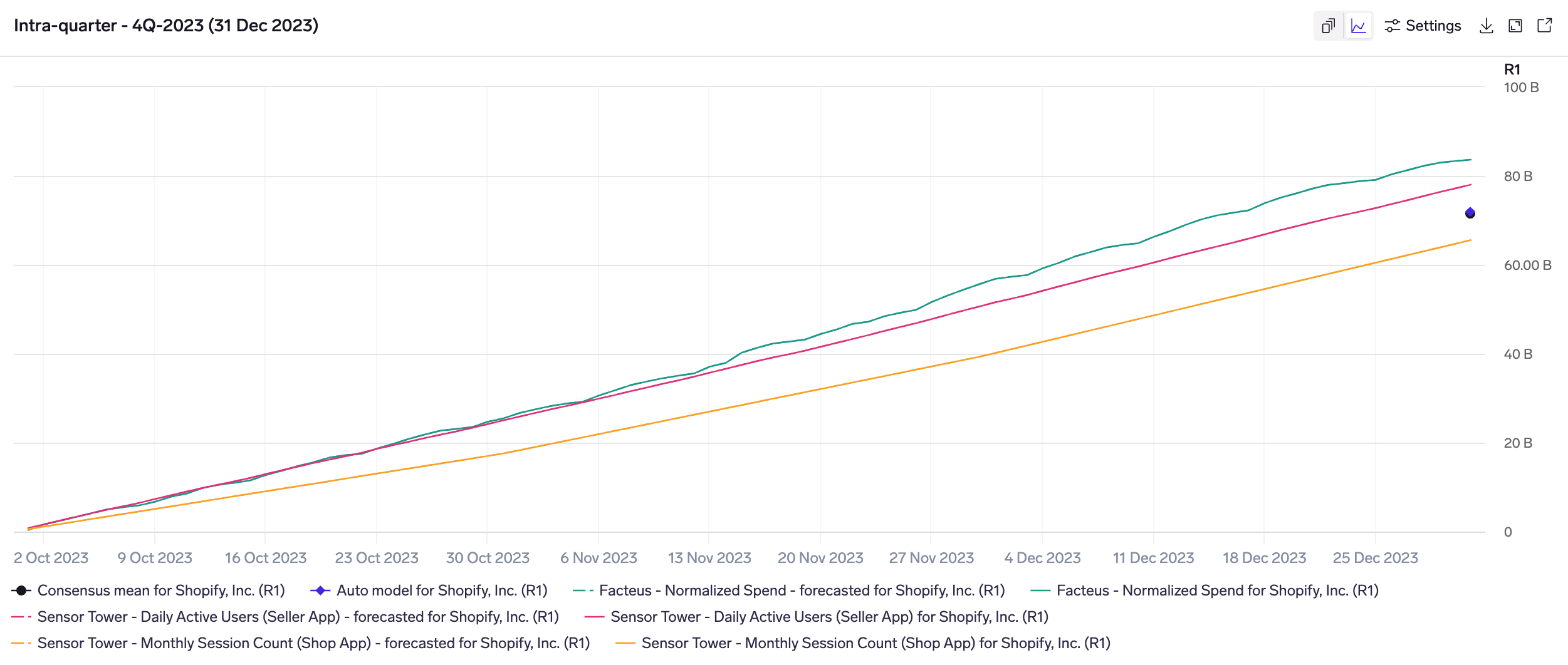
Intra-quarter chart for a model that uses data from 3 KPI mappings. The model (blue dot) is in-line with consensus (black dot); the green & red KPI mappings are predicting a beat, while the yellow mapping predicts a miss.
Underlying data
When you have selected a KPI in the overview table, you may scroll down to look at underlying data trends from the various KPI mappings.
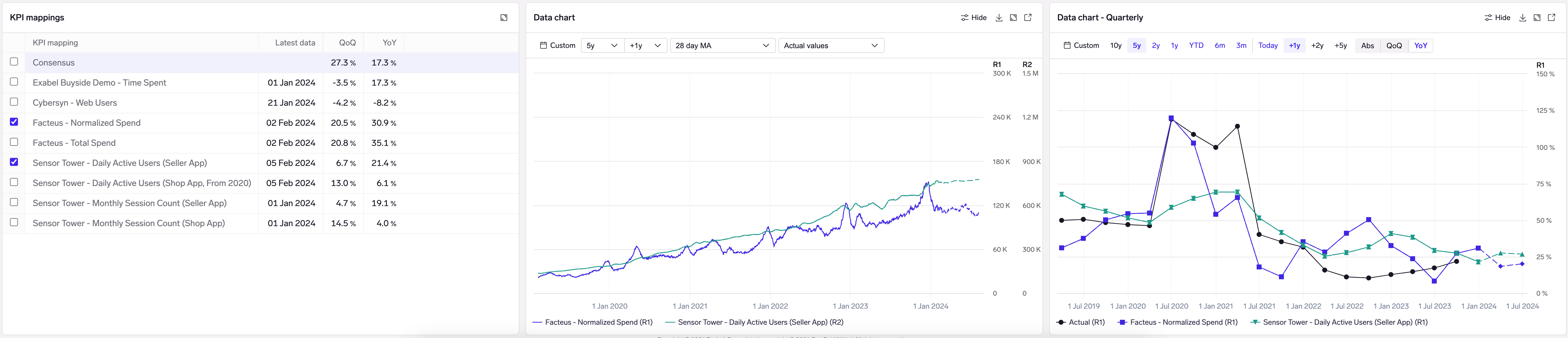
Visualizing the underlying card and mobile app data mapped to Shopify GMV
KPI mappings table
This shows all the KPI mappings available for that KPI, the latest data point date, as well as the QoQ/HoH/YoY trends in the data, as compared to consensus.
The KPI mappings used in your model are selected by default, but you may select any mapping to visualize in the accompanying data charts.
Data chart
This shows the underlying time series data for each selected KPI mapping. Click on "Settings" to change the date range or apply transformations like moving averages or QoQ/YoY change to better visualize your data.
Data chart - Quarterly
This shows the time series for each selected KPI mapping, resampled/aggregated to quarters (or semi-annuals, depending on the reporting frequency). You may also change the date range or switch between viewing absolute (Abs), QoQ or YoY numbers.
Actual (reported) values for the KPI are overlaid to help you understand visually how well your data compares tracks the KPI; it is also possible to overlay consensus by selecting it in the mappings table.
Updated about 2 months ago