Mapping KPIs
Map alternative data to company KPIs, to evaluate and identify the best signals for tracking KPIs
Mapping is the process of linking vendor data to a relevant company KPI, where there is a fundamental relationship between the data and the KPI, e.g. between card spending and company revenue. At its core, each KPI mapping is a relationship between 2 time series - the KPI and a “proxy”.
The Mappings view in the KPI Analyzer allows you to easily browse existing vendor mappings, compare mappings to identify the best signals for tracking each KPI, and test new mappings to optimize for predictive power.
Browsing mappings
In the Mappings view, the page header shows the company, KPI and frequency (quarterly / semi-annual / annual) being viewed. You can use the dropdowns to easily switch companies or view a different KPI.
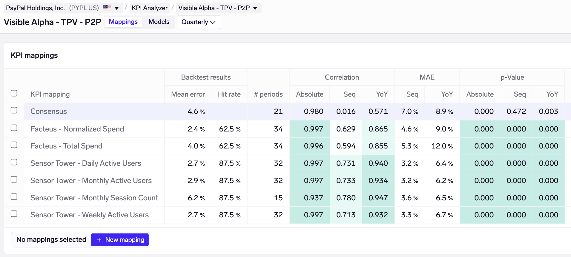
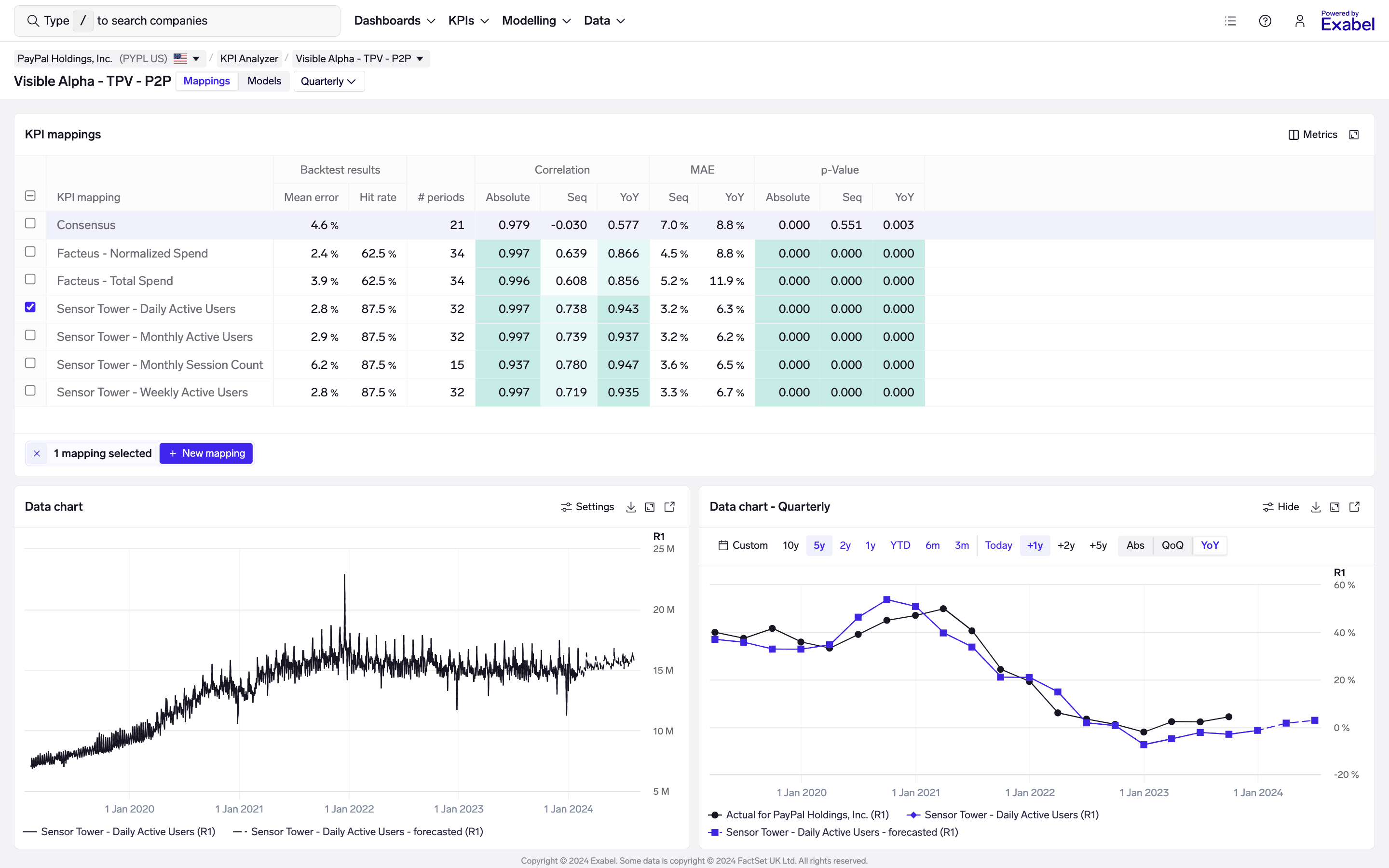
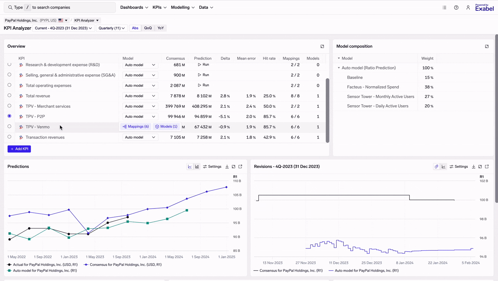
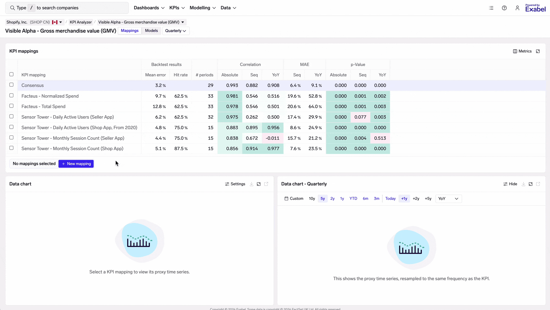
Mapping table
The mapping table summarizes all mappings for the KPI being viewed. KPI mappings created by yourself are sorted at the top, followed by curated vendor mappings.
Curated vendor mappingsExabel provides curated mappings for integrated data vendors, to help customers get started more quickly. Statistical analysis such as correlations and backtests are run automatically on every KPI mapping, which can then be compared side-by-side to identify the best proxies for each KPI.
These results are available to view even without a vendor subscription, allowing for easy discovery of data sets that might be additive. Of course, with a subscription, you will not be able to view the vendor data or use it in your own models.
Statistical tests are run automatically on all mappings, allowing you to quickly evaluate data for predictive power and benchmark different sources & signals against each other.
The following columns are provided:
- Backtest results: a model is trained and backtested using only the "proxy" time series from the KPI mapping. This is the best indicator of a KPI mapping's predictive power. (See Modelling KPIs for more details on modelling.)
- Mean error: the average difference between the backtested predictions and the actual reported KPI by the company. This is expressed as a percentage (MAPE or "mean absolute percentage error") for most KPIs, and as an absolute number (MAE or "mean absolute error") for ratio KPIs such as margin or YoY growth.
If you move your mouse over the mean error number, you can see both the MAPE and MAE, as well as the number of periods over which the backtest was calculated. - Hit rate: the % of the time the model prediction is directionally correct versus consensus. E.g. if the model predicts revenue of 100 vs consensus of 90, and the company reports 105, this is counted as a "hit" because the the model correctly predicted a beat. And vice versa, if the model correctly predicts a miss, this is also counted towards its hit rate.
- Mean error: the average difference between the backtested predictions and the actual reported KPI by the company. This is expressed as a percentage (MAPE or "mean absolute percentage error") for most KPIs, and as an absolute number (MAE or "mean absolute error") for ratio KPIs such as margin or YoY growth.
- #of periods : the number of periods (e.g. quarters) for which the KPI mapping has data. This helps you understand differences in the amount of historical available.
- Correlation: Pearson correlation between the KPI and the mapping. This is calculated on an absolute, sequential (QoQ or HoH), and YoY basis, allowing you to quickly assess correlation at a glance.
- MAE: mean absolute error between the KPI and the mapping, on a sequential and YoY basis. Note that this is calculated purely from the mapping's proxy time series alone, without any modelling / transformation, and is thus different from the mean error under Backtest results (which is the error on modelled predictions).
- p-Value: one-sided p-value from a linear regression run between the KPI and the mapping, on an absolute, sequential and YoY basis. This is another test to help assess whether a mapping has predictive power for the KPI. p-values < 0.05 are usually a good sign that a mapping is going to be predictive of the KPI, when used in a model.
Mapping details
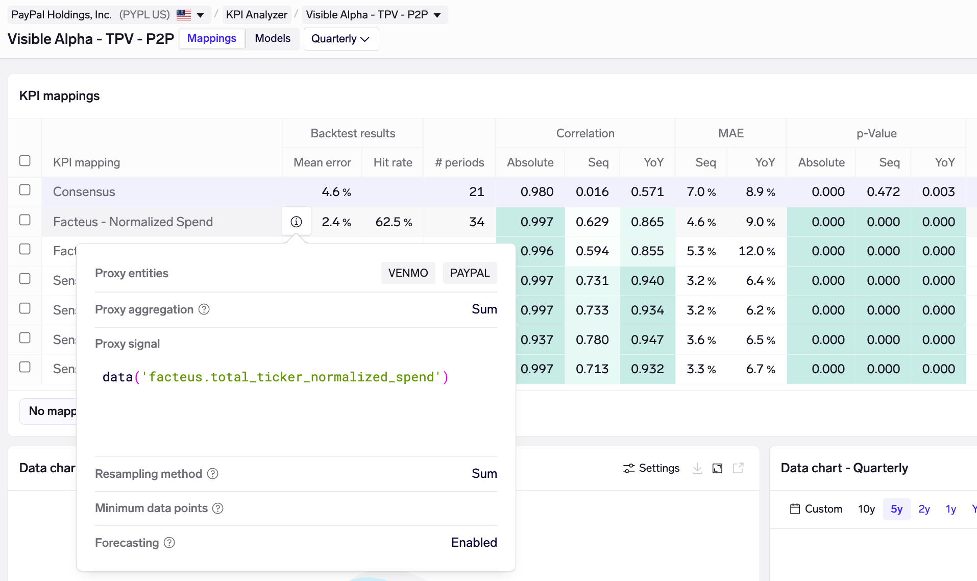
The Facteus Normalized Spend KPI mapping for Paypal TPV - P2P aggregates data from both the Venmo and Paypal merchants, using their normalized spend signal, and sums this over a quarter.
Exabel provides full transparency on how each mapping is constructed. To view details on each mapping, simply move your mouse over the mapping and click on the info icon. This opens a popover showing which company/entity it is pulling data from, the signal expression used in the mapping, and how that data has been transformed and resampled to a quarterly basis.
Data charts
In the Mappings view, you can view the data behind each mapping by selecting it in the mapping table.
Selecting KPI mappings allows you to view its proxy time series, both as-is and resampled to quarters
There are 2 charts:
- Data chart (bottom-left): shows the proxy time series as-is
- Resampled chart (bottom-right): shows the proxy time series, resampled to quarters (or semi-annual / annual, depending on the view), based on the resampling options in the mapping
Choosing a different KPI
You might find that your investment thesis involves a KPI that has no existing vendor mappings, and wish to choose a different KPI to map your data to.
Adding a new KPI to Paypal
To do this, go back to the Monitoring view and click "Add KPI". Choose a KPI from FactSet or Visible Alpha, as well as the frequency of the KPI (quarterly / semi-annual / annual). You'll then be taken to the Mappings view for the new KPI, where you'll be able to create new mappings.
You must save at least 1 mapping for that KPI (see Customizing mappings), in order for this new KPI to show up in future when you come back to the KPI Analyzer.
Customizing mappings
Curated vendor KPI mappings provide a great starting point for your own analysis. In the KPI Analyzer, you can quickly test new mappings in seconds, compare these with existing ones to see if correlation & predictive power are improved. Once you are satisfied with your results, the new mapping can be saved and starts to contribute to your data mosaic. Your new mappings can then start to feed into your custom models (see Modelling KPIs).
To customize mappings, you must have opened the KPI Analyzer for a company, and navigated to the Mappings view. Then, simplify click on "New mapping":
Testing a new KPI mapping for Shopify, comparing its performance vs existing mappings, and saving
Basic details
When creating a new mapping, you'll be asked to fill in a few details:
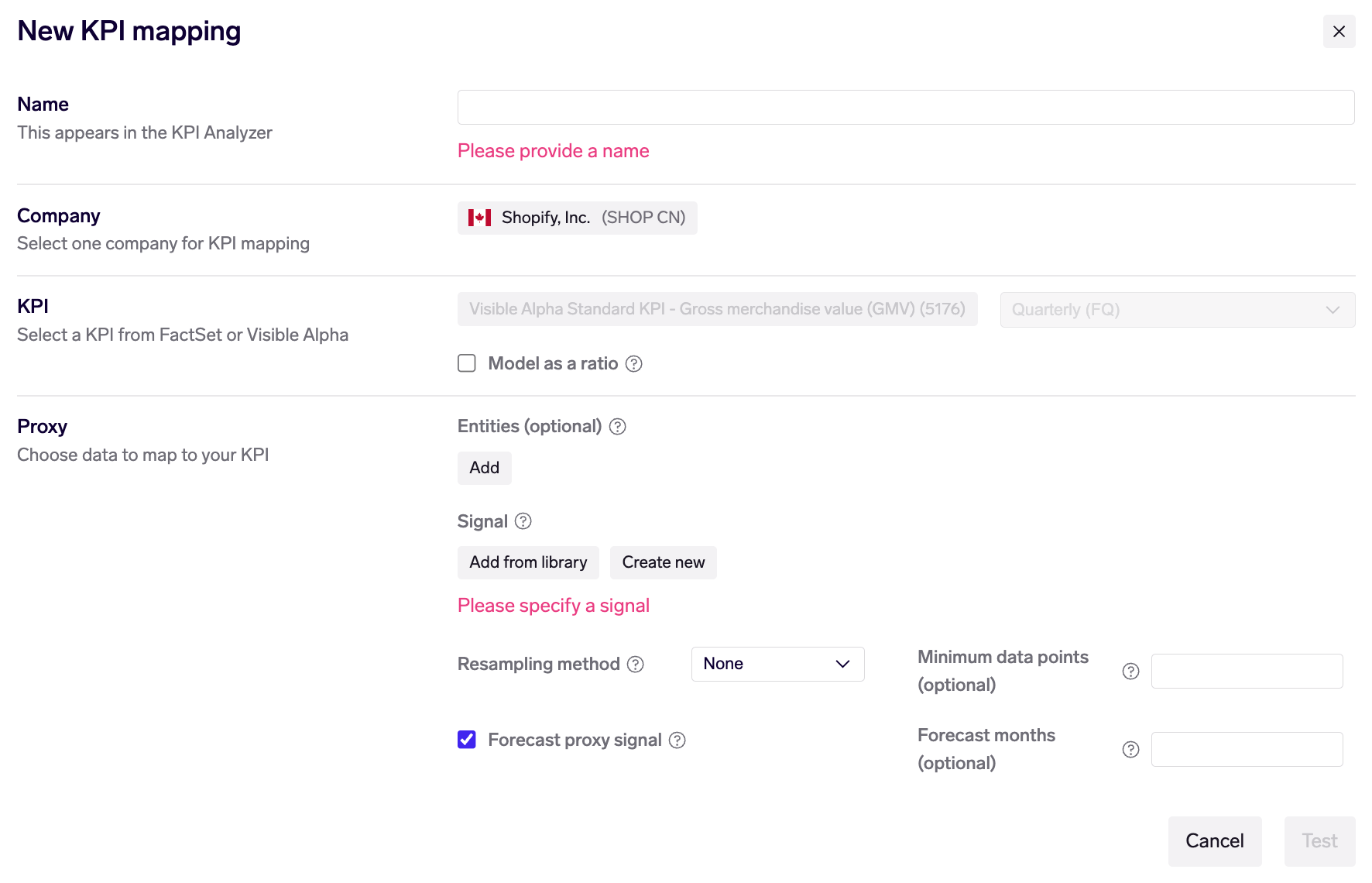
- Name: this helps to identify your KPI mapping, and is displayed in the KPI Analyzer
- Company and KPI: these are set to the current company and KPI in the KPI Analyzer
- Model as a ratio: check this box if the KPI is a ratio KPI, such as a margin or YoY. When this is applied, we calculate and model based on absolute change rather than relative (percent) change, as it doesn't make sense to calculate % change on a KPI that is already a percentage. Additionally, we apply a different default model (SARIMAX) which is better suited to ratios - although you may still choose a custom model type (see Modelling KPIs).
Proxy
This defines what data you want to map to the KPI, and what transformations are applied in the mapping process.
-
Entities (optional): leave this blank if you want to use company-level data. If you want to use data on a specific entity (merchant, app, web domain, etc), choose it here. You may also choose more than 1 entity, in which case you'll also be asked whether you want to sum or average their time series.
Using proxy entitiesProxy entities allow you to choose a specific, granular slice of data, rather than limit yourself to only using company (ticker)-level data.
-
Signal: Use an existing signal from your Library (provided by vendors, or created by yourself / your team), or use a new custom signal expression. This provides full flexibility to transform your data to best track the KPI.
-
Resampling method: Choose how to resample your proxy data down to the same frequency as the KPI (quarterly / semi-annual).
- None: no resampling is done. Only proxy data points that fall exactly on the period-end date (quarter-end date) are used.
- Sum: all data points within a period are summed to produce a quarterly / semi-annual number, which is then mapped to the KPI.
- Mean: the mean (average) of all data points within a period is calculated.
- Mean times days: the mean of all data points within a period is calculated, and then multiplied by the number of days in that period.
- Median: the median of all data points within a period is calculated.
Exabel automatically upsamples to daily firstIf you choose a resampling method (other than None), your proxy will be automatically upsampled first to a daily frequency, before being resampled to quarters / semi-annuals.
Also, if the resampling method is Sum, we first infer the frequency of your proxy and divide it by the number of days. For example, if you have weekly data, we'll divide each weekly data point by 7 and upsample it to a daily frequency.
This is particularly useful for dealing with weekly or monthly data which doesn't fully align with a company's fiscal calendar, where the first / last month in a quarter may overlap into the previous / next quarter respectively.
We are intending to introduce a configuration option for users to disable this if they disagree with this default.
Resampling - suggestionsIf you have daily, weekly or monthly data, you should choose a resampling method so as to utilize all the data points in each period.
- If your KPI is a revenue KPI or more generally a "flow" KPI (e.g. gross merchandise value, orders, volume), you should generally choose either Sum or Mean times days as the method.
This is because both methods will account for the fact that some quarters have more days than others. For flow KPIs like revenue, a quarter with 91 days will, ceteris paribus, produce more revenue than a quarter with 89 days.
Sum is simpler to understand, but Mean times days is more robust to missing data points - e.g. if your data source is missing several data points within a quarter, Mean times days will effectively impute a value for those missing points (using the average of the available points).- If your KPI is a quarterly average or more generally a "stock" KPI (e.g. average order value, gross margin, number of subscribers), you should generally choose Mean as the method.
This is because the KPI every quarter would not be affected by the number of days in the quarter.If you have quarterly data, you should generally not resample by choosing None (unless you are mapping to a semi-annual KPI).
- However, it will be key to ensure that your quarterly data is aligned on the exact same dates as the company quarter-end dates, or no results will be produced.
- The align_to_dates() function, which may be used in the proxy signal expression, is helpful for these cases.
- When aligning your dates to the company fiscal calendar, consider when the quarterly data points are available, and therefore which quarter they cover. For example, a quarterly survey data set may provide data points on 31 Mar / 30 Jun / 30 Sep / 31 Dec every year, available within 2 weeks of quarter-end. If a company's fiscal year ends in April, you may decide that the Jan-Mar data point (provided on 31 Mar) should be aligned to the April quarter, and so on.
- Minimum data points: The minimum number of data points required in each period (quarter / semi-annual) in order for the proxy to be used.
- Forecasting: Configure whether to forecast the proxy signal, and for how many months in the future.
Forecasting in KPI analysisBy default, Exabel applies forecasting to all KPI mappings, up to 6 months into the future. Forecasting is applied to the underlying proxy signal, before resampling takes place.
This is useful for dealing with the current period where there may be incomplete data. This is especially important for companies with strong seasonal effects. For example, Amazon has a significant seasonal peak in shopping activity over Christmas. If we were in October and have only 1 month of data for the Oct-Dec quarter, the data would not cover this seasonal peak, and doing any QoQ/YoY calculations with just the October data alone would produce misleading results. By applying forecasting, we can use prior years' seasonality to extrapolate the known trends observed through October, and produce a better prediction.
This also allows Exabel to produce predictions on the next period, where there is no data available at all, but where current data trends can give a rough indication of trends heading into the next period, and therefore give users an idea about how the company might guide for the next period when reporting results.