Modelling KPIs
Combine KPI mappings from multiple sources to train models that predict KPIs
Modelling is the step of taking one or more KPI mappings and combining them to train an optimized model that makes accurate predictions of the KPI. Such models often combine data from multiple vendors in order to reduce prediction error.
KPI Analyzer models view
The Models view in the KPI Analyzer allows you to easily browse existing models, run new models that combine data from multiple sources, deep-dive to analyze historical model performance.
Browsing models

In the Models view, the page header shows the company, KPI, frequency, and period being viewed (quarterly / semi-annual / annual). You can use the dropdowns to quickly switch companies or view a different KPI. The Abs/QoQ/YoY buttons let you toggle between absolute, QoQ and YoY predictions.
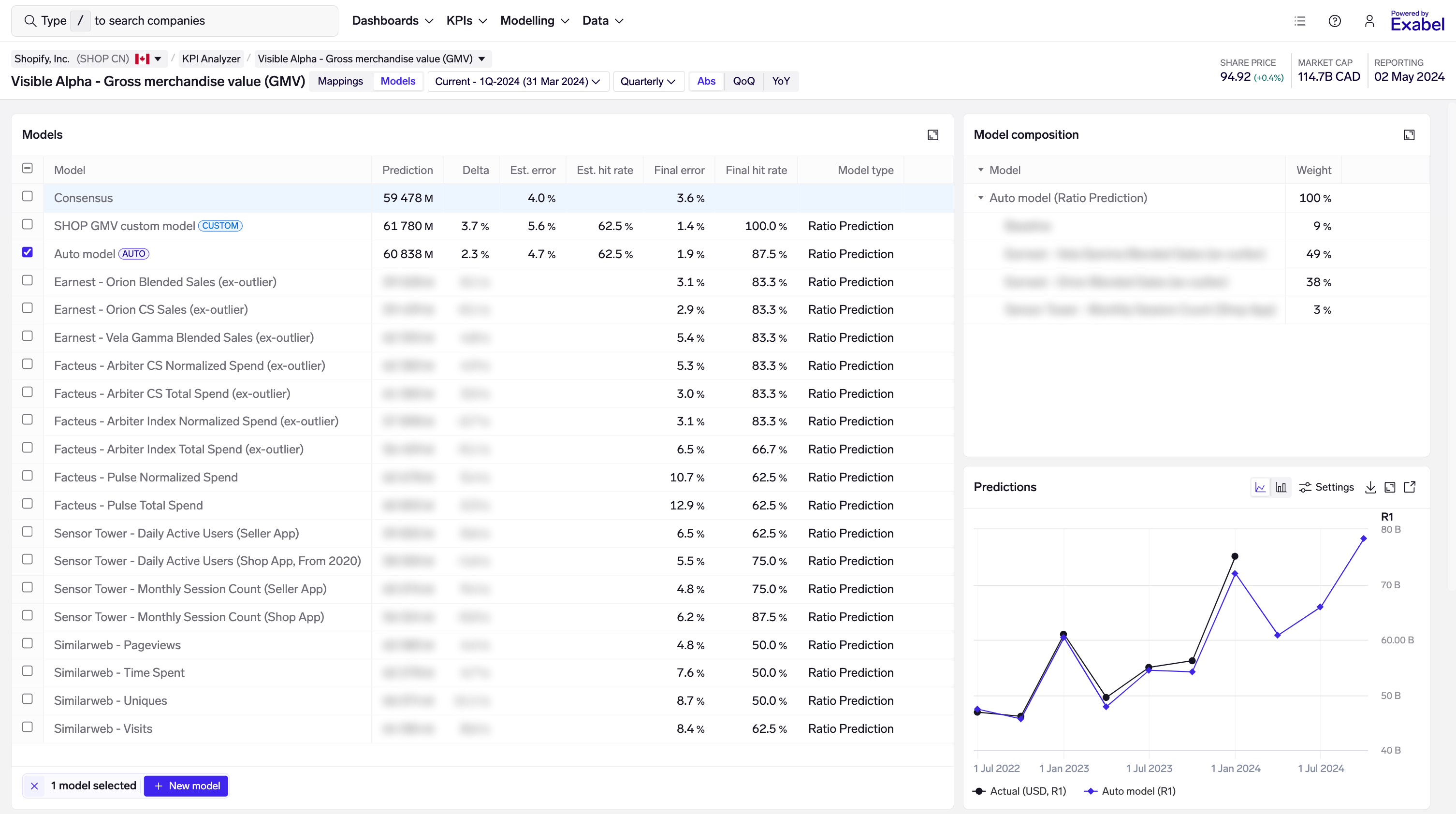
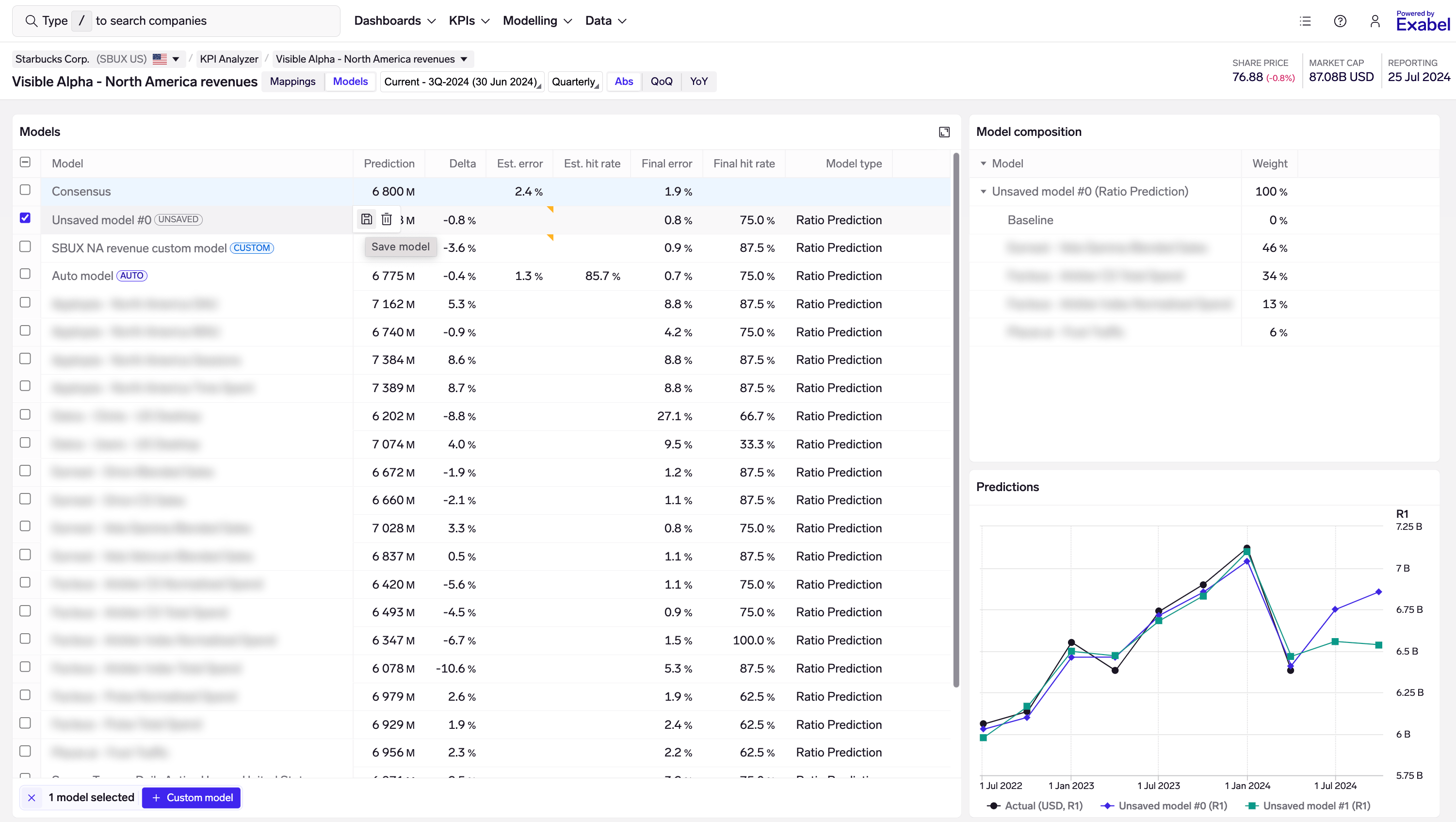
Models table
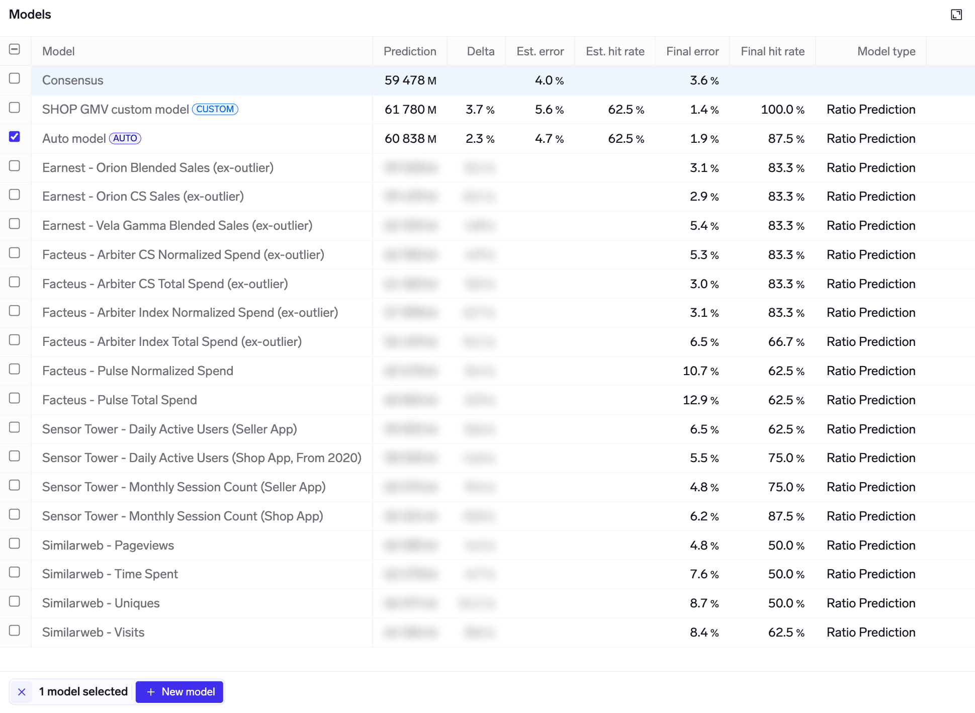
The models table shows all the models that are available for this KPI. Your own models, and those that have been shared to you, are at the top, followed by curated models from data vendors.
Select one or more models to view their predictions and other details in the charts on the page.
There are 3 categories of models shown in the table:
- Auto model: denoted by the
Autobadge; this is automatically run when you enter the Models view, and considers all available inputs (i.e the standalone models you see in this table) in order to train an optimized model. - Custom models: denoted by the
Custombadge; these are models that you may choose to build with your choice of inputs (standalone models), model type, and model parameters. See Customizing models to learn more. - Standalone models: each KPI mapping (ref Mappings view) has its own standalone model, which uses only data from that KPI mapping to predict the KPI. These are then be combined into the Auto model and custom models.
You'll find standalone models from each vendor subscription that you have, but if you create your own custom KPI mappings, those will also have standalone models.
Non-subscribed vendor results are also shownSimilar to the Mappings view, model results from vendors that you are not subscribed to are also shown in the Models view, sorted to the bottom. Model predictions are not shown, but the backtested errors are available to view.
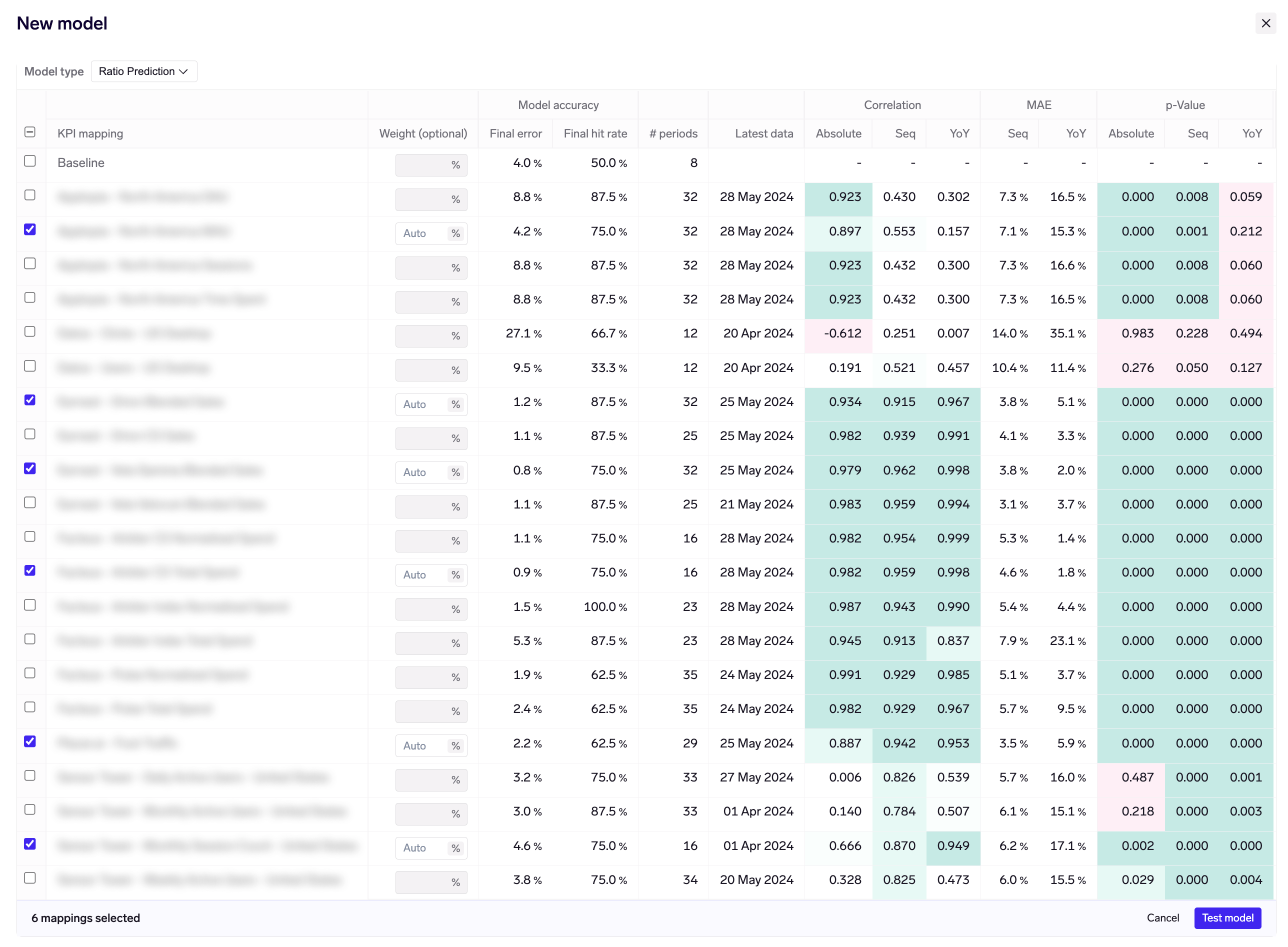
The following columns are shown in the table:
- Prediction: model prediction for the period being viewed. You can view predictions for the last / current / next period through the dropdown in the page header.
- Delta: delta vs consensus mean of the KPI. This is shown as a percentage for most KPIs, and in absolute terms for ratio KPIs (e.g. gross margin).
- Est. error: model estimated mean error, using point-in-time modelling based on where we are in the quarter/period. E.g. if we are 30 days from quarter-end, this calculates the mean error of historical predictions made using data available 30 days from quarter-end for each historical quarter.
Consensus estimated errorThe consensus row also has an estimated error, which is calculated on a like-for-like basis to models.
For example, if we are 30 days from quarter-end, we look at consensus as-of 30 days from quarter-end for each historical quarter, and calculate its mean error on that basis.
- Est. hit rate: directional accuracy of predictions vs consensus, using point-in-time modelling based on where we are in the quarter/period. Calculated as the % of the time when the model predicts a beat/miss, that the company also reports a beat/miss.
- Final error: mean error of historical predictions, when all data is available for each quarter/period.
- Final hit rate: directional accuracy of predictions vs consensus, when all data is available for each quarter/period. Calculated as the % of the time when the model predicts a beat/miss, that the company also reports a beat/miss.
- Model type: the type of model being used. "Ratio prediction" is the proprietary Exabel model used by default, though you can train your own custom models with other model types.
Error & hit rate are calculated on the most recent 8 quartersWe calculated the estimated & final error / hit rate based on the most recent 8 quarters / periods.
In some cases, this may be based on fewer than 8 periods as there was insufficient training data to produce 8 backtests. However, these metrics will only be calculated if there are at least 4 periods.
Consensus estimated & final error are also calculated on the most recent 8 quarters, in order to provide a like-for-like comparison.
Model status
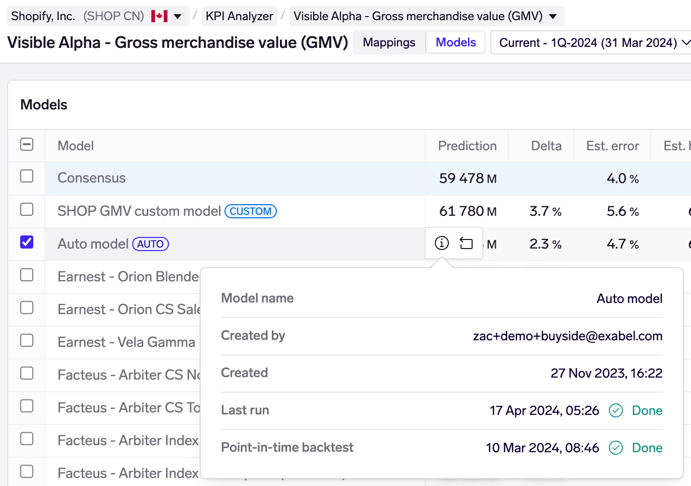
You may find status information about each Auto & custom model by hovering over the model and clicking on the information icon. This shows you the user who created the model, when it was created, latest run (models are run daily).
The point-in-time backtest, which is required to calculate the estimated error and hit rate metrics, is run only once when the model is first created. This takes longer to run (minutes), so when you create a new model, you may track its status here.
Model composition table
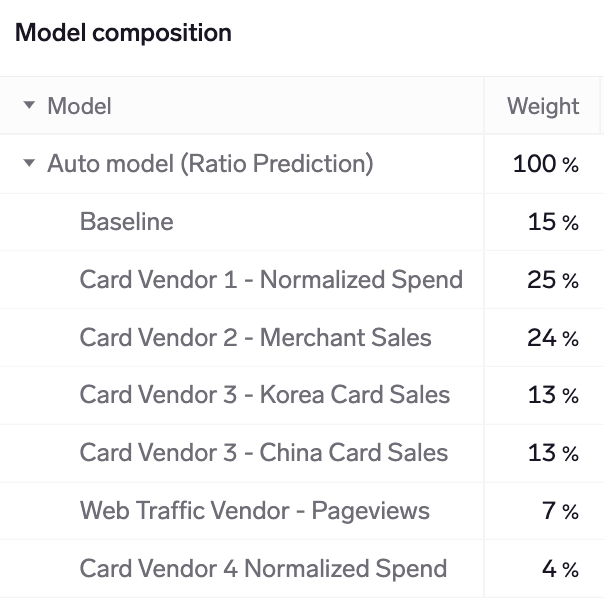
The model composition table shows how your Auto models and custom models combine data from your available KPI mappings when making predictions. This is not applicable to standalone models, which use data from only 1 KPI mapping.
Weights are shown for the current quarter/periodNote that the model composition table always shows weights for the current quarter/period, even if you have chosen to view the last/next period.
Weights for historical quarters may be different from weights for the current quarter. That is because our models optimize for predictive power by choosing the inputs (KPI mappings) that have been most accurate at each point in time. This is always done in Auto models and by default in custom models, unless you fix the model weights (see Customizing models below).
Providing visibility on model weights for every quarter is on our near-term product roadmap.
Model weights are determined by the training & backtesting process. Generally, the more predictive power that a standalone model has (lower "Final error" in the models table), the higher the weight it will be assigned.
Under the hood, Exabel uses an algorithm to minimize the expected model variance (error), based on the full error covariance matrix of all inputs (KPI mappings). Hence, in some cases the model will choose to put higher weight on a combination of standalone models, that individually may have higher prediction errors, but in combination are expected to have a lower error.
Predictions / errors chart
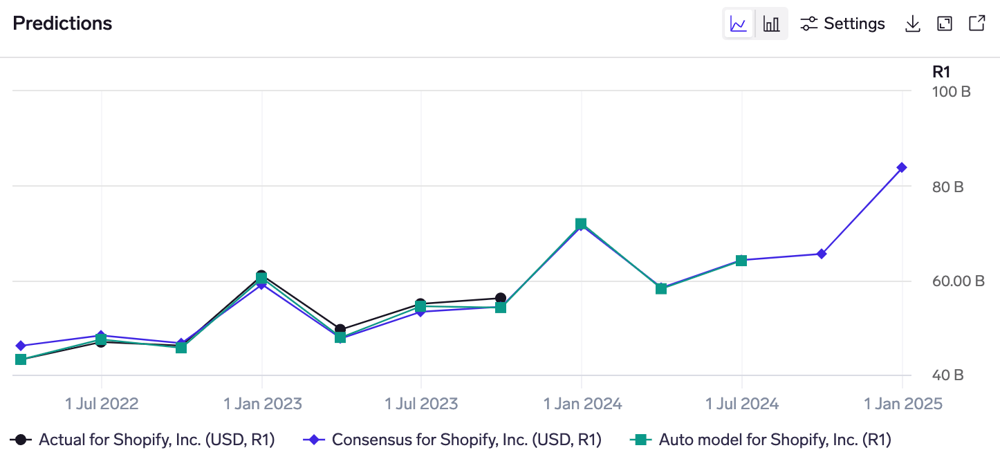
The predictions chart shows the quarterly series of model predictions, overlaid with the actual (reported) KPI, and consensus mean. You can select multiple models in the Models table to view them in the same chart.
Following market convention, consensus for historical quarters is shown as-of immediately before the company reports results, and consensus for future quarters is the live consensus as of today.
Model predictions are a mix of backtests & live predictionsWhen you first run a model, we aim to generate backtested predictions for the most recent 8 quarters. (Sometime, there are fewer than 8 if the KPI mappings have limited history.) These backtested predictions will appear in this chart, alongside the predictions for the current and next quarters.
Example: a model is first run in February 2024, after the company has already reported 4Q-2023 results. It generates backtests for the most recent 8 quarters, ie 1Q-2022 - 4Q-2023, and starts making predictions for the current (1Q-2024) and next (2Q-2024) quarters. Fast-forward 3 months, and the company has now reported 1Q-2024 results. The predictions chart would show 9 historical quarters of predictions (8 from the backtest & 1 live prediction), as well as predictions for 2Q-2024 (now the current quarter) and 3Q-2024 (now the next quarter).
The date range may be changed through the Settings button, and there is a download button to get an Excel file with the chart data.
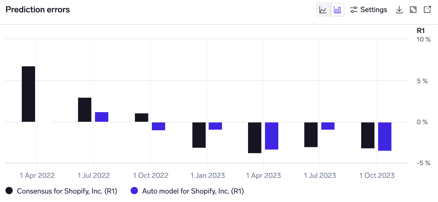
In the same widget, you can switch to the predictions errors chart by clicking on the bar-chart icon in the top-right corner. This shows the quarterly errors relative to the actual KPI value for each historical quarter.
Positive numbers indicate where consensus/models predicted above what was reported, and vice versa.
This can help to more easily identify quarters where the model performed strongly / poorly, visualize the relative errors between models and consensus, and analyze if model performance has been improving / worsening over time.
Revisions chart
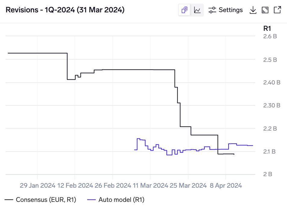
Model revisions for Kering's 1Q-2024 Gucci revenue KPI, showing a non-consensus bearish prediction, subsequently proven right by a profit warning, followed by significant consensus downgrades.
The revisions chart overlays consensus and model revisions in the same chart. Model revisions are only tracked once a model has been run, so you may need to wait a few days before a revision history line starts to build.
Intra-quarter chart
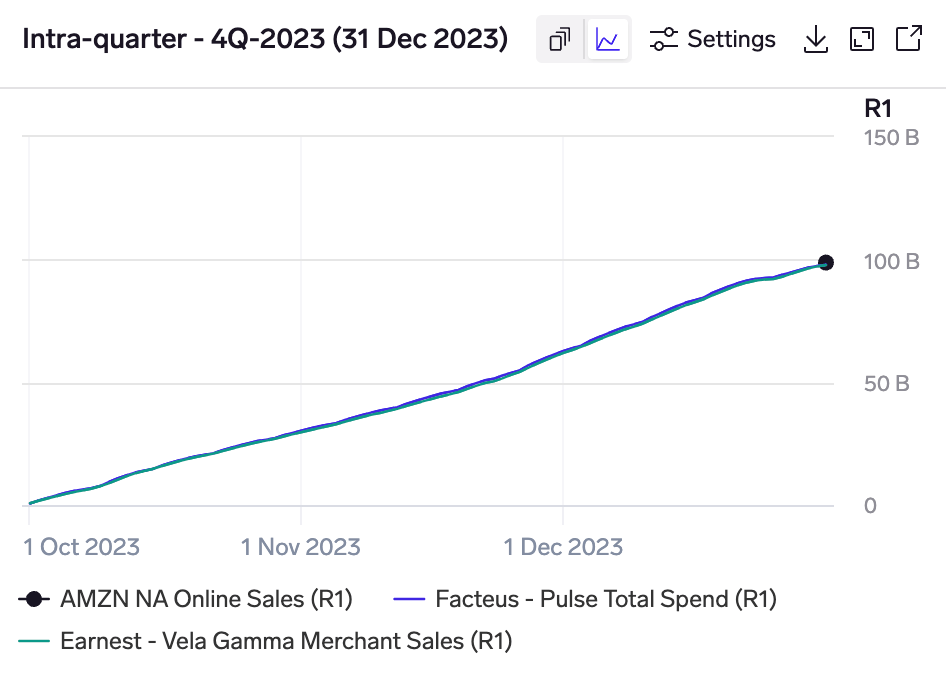
Intra-quarter chart for Amazon's 4Q-2023 shows a hump in December as spending is concentrated around the holiday period.
The intra-quarter chart shows how each model "builds-up" through a quarter to its prediction. Auto models & custom models are shown as a point at the quarter-end, while the standalone models that they use are shown as lines that build up to the prediction based on the intra-quarter data.
Probability distribution chart
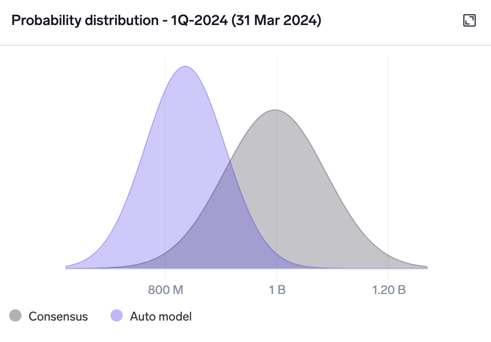
Probability distribution chart for Kering's 1Q-2024 North America revenue KPI shows a non-consensus bearish call.
The probability distribution chart plots an estimated distribution of predicted outcomes. This helps to visualize the relative confidence of the model vs consensus, as well as where the model is predicting a significantly non-consensus outcome.
For each selected model and consensus, a normal distribution is plotted centred on the model prediction / consensus mean, with a width determined by its estimated error.
Point-in-time analysis chart
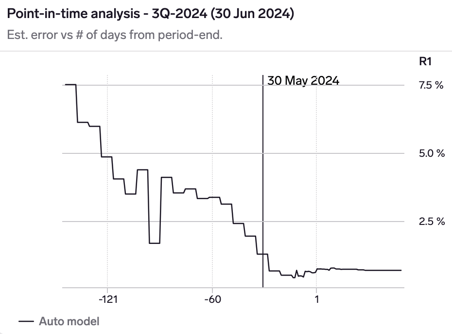
Point-in-time chart for Starbuck's North America revenue KPI shows that the model has an estimated error of 7.5% 1.5 months before the quarter, declining to 4% at the start of the quarter, 1.3% as-of 30 May 2024 (1 month before quarter-end), and finally 0.7% at quarter-end.
The point-in-time chart shows how the model's estimated error changes as we progress through a quarter, as more data becomes available.
This allows you to understand whether you should wait for incremental data, and how much more model confidence you will gain by waiting.
Customizing models
While Exabel's Auto model provide a convenient way of getting models up and running for your companies, Exabel also allows you to run custom models with your choice of model inputs (features), model type, and model settings.
To do this, click "+ Custom model" in the Models view:
From here you can choose a different model type, and select which KPI mappings to use as inputs / features in your model. For the main "Ratio prediction" model type, you can also specify the model weights, or leave them empty to let the system optimize weights for you.
Clicking on "Test model" will run your model, which usually takes a few seconds to complete.
New models appear as "Unsaved", allowing you to test various combinations of vendor KPI mappings and model types. When you are happy with your results and want to keep a model, mouse over the model and click on the Save button:
Once saved, your custom models will be refreshed every day with updated predictions based on the latest data, and re-trained every quarter once the company reports and there are new ground-truth data points. (This is the same as what is done for Auto models.)
Model actions
Certain actions are possible for each model, by mousing over the model in the table:
-
Model details: this can be viewed for every Auto & custom model by clicking the ⓘ button:

- Re-run model: Auto models can be re-run by clicking the "Re-run" button. This is useful when you add a subscription to a new vendor with KPI mappings that are significantly more predictive than your existing set of mappings. In such cases, existing Auto models will show backtest errors that still reflect the old set of KPI mappings (because historical backtests are not updated retrospectively once a model has been run).
Re-running a model acts as if you were to delete the model and run a new model from scratch, thus producing a new set of backtests and errors that should be more reflective of your new set of KPI mappings.Re-running an Auto model will reset its revision historyNote that re-running a model will cause you to lose the revision history you have built up in the model. This is a trade-off to consider.
Exabel recommendation: re-run your Auto model only if your new KPI mappings are significantly more predictive than your existing ones, and thus likely to meaningfully affect the model error estimate (which is based on backtested errors). One easy way to test this is by running a test custom model with the new KPI mappings, and seeing if the model error is significantly improved.
Note also that Exabel uses point-in-time backtesting to produce a simulated revision history for every Auto/custom model, which can make up for the loss of the live model revision history.
- Delete model: custom models can be deleted by clicking the "Delete" button. This allows to clean up your KPI Analyzer view by deleting models that you no longer need.